
SUMMARY
TIMELINE
Sep 2024 - Dec 2024
TEAM
DonorAtlas CEO
1 Project Manager
3 Designers
SKILLS
Data Visualization
Information Hierarchy
UX/UI Audit
Web Design
TYPE
Contract
Turning complex donor data into actionable insights with a refined search experience.
DonorAtlas struggled with low retention rates as users found it overwhelming and challenging to sift through the donors given the lack of curated information that was relevant to them.
To address this, I worked on the search and donor profile page where, I optimized for a smooth and intuitive search experience by simplifying the results management bar. For the donor profile, I prioritized relevant information to users to reduce the cognitive load on users and introduced customizability for a personalized experience.
INTRODUCTION
DonorAtlas is a self-serve platform for nonprofits and political campaigns to find suitable donors.

Raising money for campaigns and nonprofits is slow, manual, and expensive. Campaigns typically spend $25,000 annually on fundraising, and searching for suitable donors requires consultants, which can take days.
DonorAtlas aims to address this problem by acting as a self-serve platform for campaigns and nonprofits to find and understand donors in seconds.
Its key features include detailed profiles with reference links and potential connections to leverage.
THE PROBLEM
Users felt overwhelmed by the complex search process which requires deep donor research.
The existing search page displayed an abundance of information on the biographical, financial, and political interests of donors, leaving users overwhelmed with information.
My task was to make the search and profile page more digestible to users so that they are easily able to sift through donors to find their perfect match.

How may we expedite and ease the search process for donors to limit cognitive overload and maximize relevance?
GOALS
Empower uses to find suitable donors quickly and confidently.
Our goal is to streamline the donor search experience by reducing cognitive overload, highlighting relevant information, and making complex donor profiles easier to navigate and understand.
Reduce cognitive overload
Simplify the amount and presentation of information so users don't feel overwhelmed during their search.
Enhance information relevance & digestibility
Organize and present biographical, financial, and political data in a way that’s easier to scan and understand.
Streamline the search process
Make it easier and faster for users to sift through donor profiles and find the right match.

AUDIT
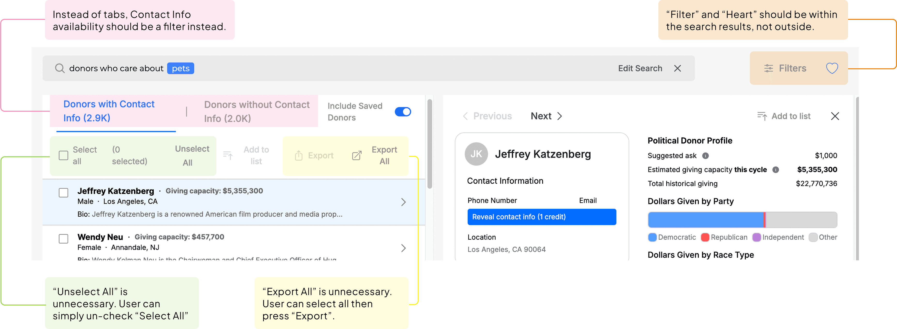
The results management bar had many redundant and confusing functionalities that contributed to users cognitive overload.
I started off by examining and conducting an audit of the existing product and identified numerous usability issues that would impact the user's search journey. Notably, the organization of functions for the results management bar was not well thought-out. Many of the actions were redundant or placed in unintuitive locations.
For example, actions such as "Unselect All" and "Export All" are redundant because users could simply un-check "Select All", and "Select All" then press "Export" respectively to complete those tasks.
ITERATIONS
Designing for efficient actions and easy navigation by removing clutter for improved clarity.
My first iteration consisted of simplifying redundant actions such as "Unselect All" and "Export All", and grouping associated functions such as Filter with the search results, addressing the initial disconnect between the Filter and the search results.

This version presented a cleaner UI with clearer actions and accessible functionalities.
ITERATIONS
Enhancing navigation and discoverability through user-centered interaction design.
After speaking to users and conducting usability testing, the developer and CEO adopted most of the changes on the results management bar.
For this iteration, they requested to implement tabs for "All", "New" and "Saved" as users found this would be helpful in their search. Additionally, users noted that the "Filter" on the previous iteration was not very visible, so I highlighted it in this version.

ITERATIONS
Driving efficiency and user confidence through clear, distinct indications and feedback.
For the final iteration, I made minor tweaks to the results management bar, focusing on the details, such as standardizing the iconography, and providing action feedback by indicating the number of selections.
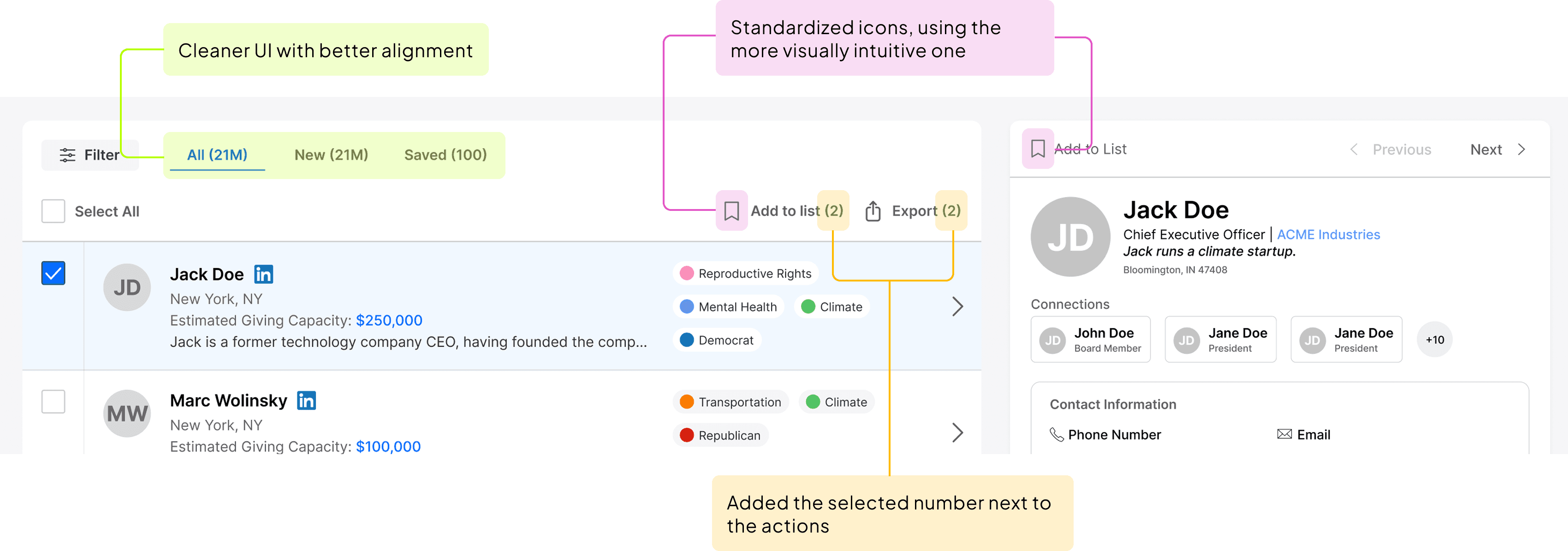
This helps users efficiently navigate their results with confidence as there is less ambiguity.
AUDIT
Poor visual hierarchy and scannability of the biographical information slows down decision-making.
Lacks visual cues and scannability
Dense text blocks and minimal variation in typography or layout make it hard to quickly identify key information.
Inconsistent information hierarchy
Users struggle to distinguish between primary details and supporting context.
Poor alignment and visual layout
Misaligned text and uneven spacing across columns disrupt the visual balance and reduce the clarity of grouped content.
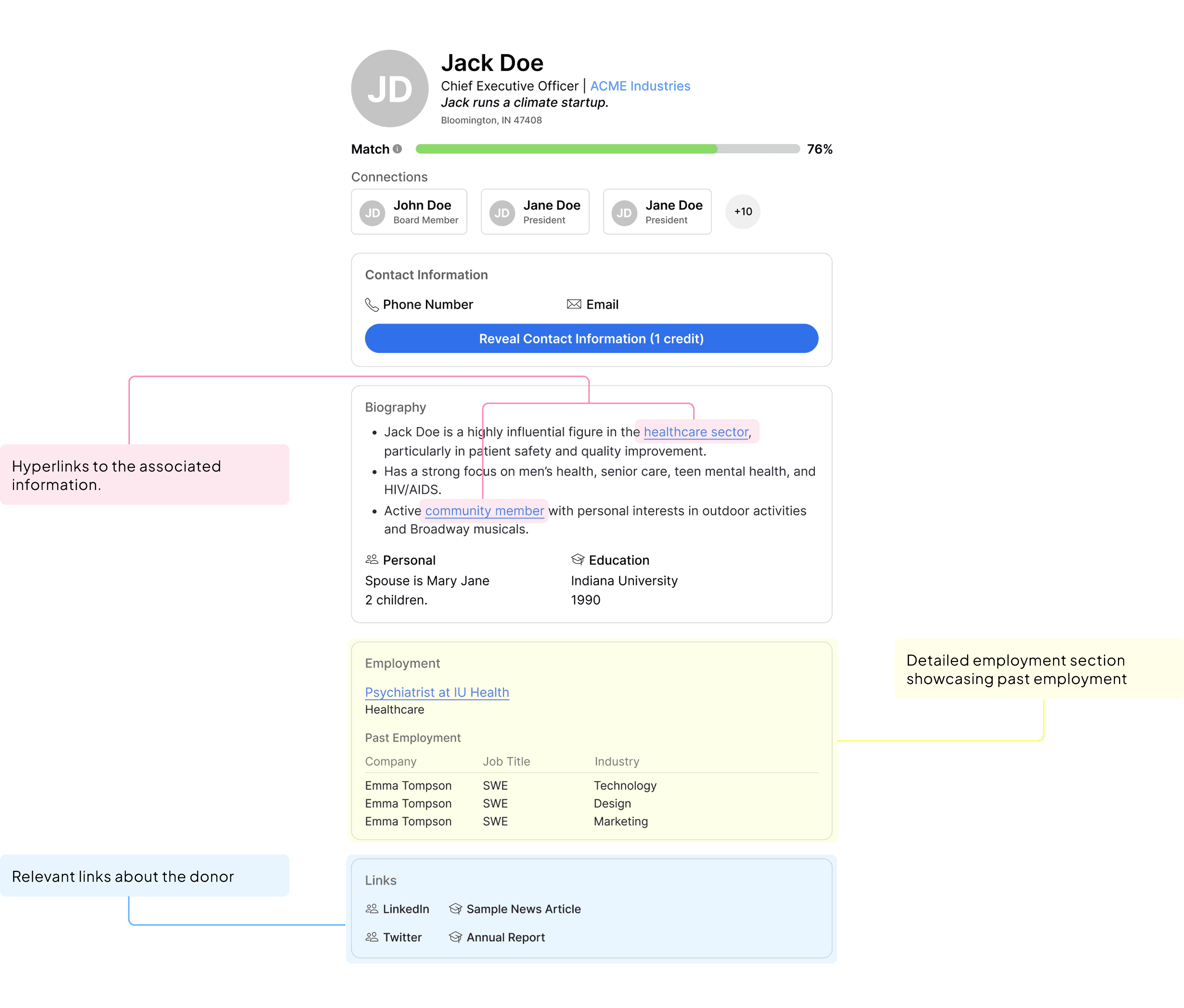
In addition to the existing usability issues, the developer and CEO wanted to incorporate several new features (Connections, Match, Explainability, Financial Info) into the donor profiles, which I conceptualized from scratch.
ITERATIONS
Enabling users to quickly assess relevance and make informed decisions.
For my initial iteration, I incorporated the new features requested by the developer and CEO, as well as worked to address the visual anad usability issues identified above.
Notably, I introduced supporting iconography that would provide visual cues for easier scanning. I also reformed the information hierarchy by grouping together related information.

For this version, I focused on prioritizing information that I felt would be most relevant to users, such as the new Explainability and Connections features that would indicate the relevance of the donor to the users search and mutuals with the donor respectively.
ITERATIONS
Enriching the profile’s informational value while reinforcing credibility and reducing the need for external research.
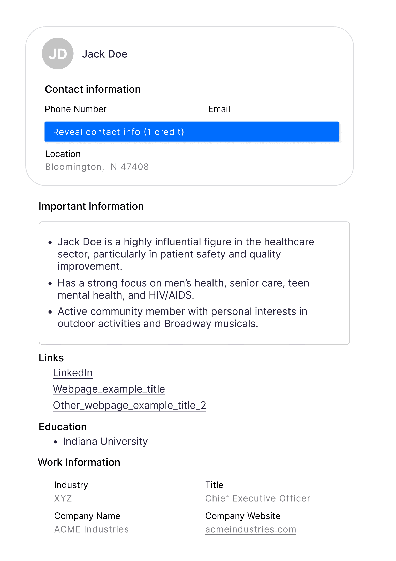
Based on developer and CEO feedback, version 2 focused more on adding informational value to the profile pages with hyperlinks as well as a detailed history of their employment.
AUDIT
The Political Profile lacked content relevance and under-emphasized key metrics, hindering users’ ability to quickly extract value.
The Political Donor Profile side shared similar visual and usability issues as its biographical counterpart.
Relevance of information to users varies
This section offers a wide range of information that will likely not be useful for all users.
Inconsistent information hierarchy
Headers are competing with the supporting text, making it hard for users to scan through information.
Low visual priority on key figures
Important metrics like “Estimated Giving Capacity” and “Total Historical Giving” could be visually emphasized further

ITERATIONS
Improving user comprehension by structuring complex data into a more digestible, personalized, and visually intuitive experience.
I redesigned the interface to enhance clarity and personalization by surfacing high-value metrics, organizing related content under collapsible sections, and introducing customizable and color-coded visual elements that support faster scanning and reduce cognitive load.

ITERATIONS
Fine-tuning the details for the interest tags for a cleaner look and easier scannability.
I iterated on the interest tags several times, initially attempting to incorporate supporting iconography.
I realized this was unproductive this would render the tags un-scalable for smaller uses. I then worked in colors, ultimately settling on a circular colored dot to balance scannability with simplicity.

FINAL SOLUTION
Fine-tuning the details for the interest tags for a cleaner look and easier scannability.
Easily switch between the donor's biography and political donor profile to customize the view to your interests.
Use the CUSTOMIZE function to further tailor the information to your preference.
Users struggled with information overload on the profile pages.
To address this, I separated the biographical information from their donor profile, as well as introduced an element of customizability so that users can easily view information that is only relevant to them.
NEXT UP →
DoorDash
2023