Phia
Sales Calendar
End-to-end design of a safety tool to keep you and your loved ones safe
Project Overview
Role
Lead Product Designer
Timeline
June – Aug 2026
Team
1 PM + CEO
4 Engineers
Discipline
0-1 Design
Product Strategy
Navigating Constraints
From just checkout utility

to
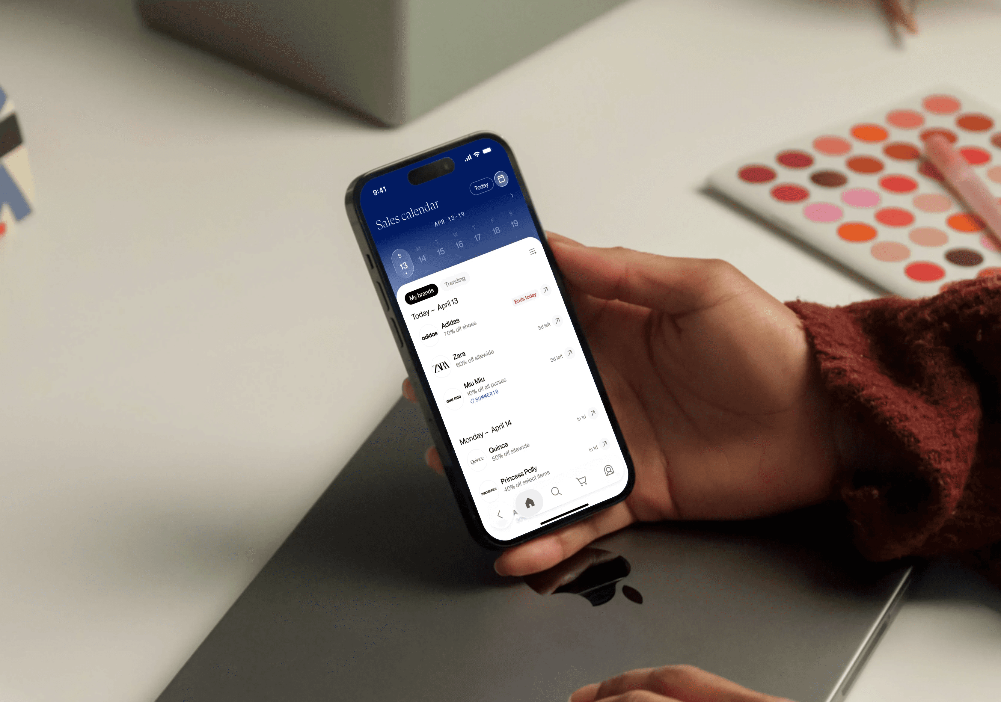
Sales Calendar is a new feature in the Phia app, where users can browse discover sales, increasing app-driven purchases.
Making data-dense experiences easier and more enjoyable to browse
I revisited timeline constraints in V1 and introduced brand imagery in V2 for a more engaging experience.

Redircect

bottom sheet
I designed the bottom sheet to communicate automatic redirect to the sale while giving them an opportunity to cancel.
Context
Phia was effective at saving users money at checkout, but not yet at discovery
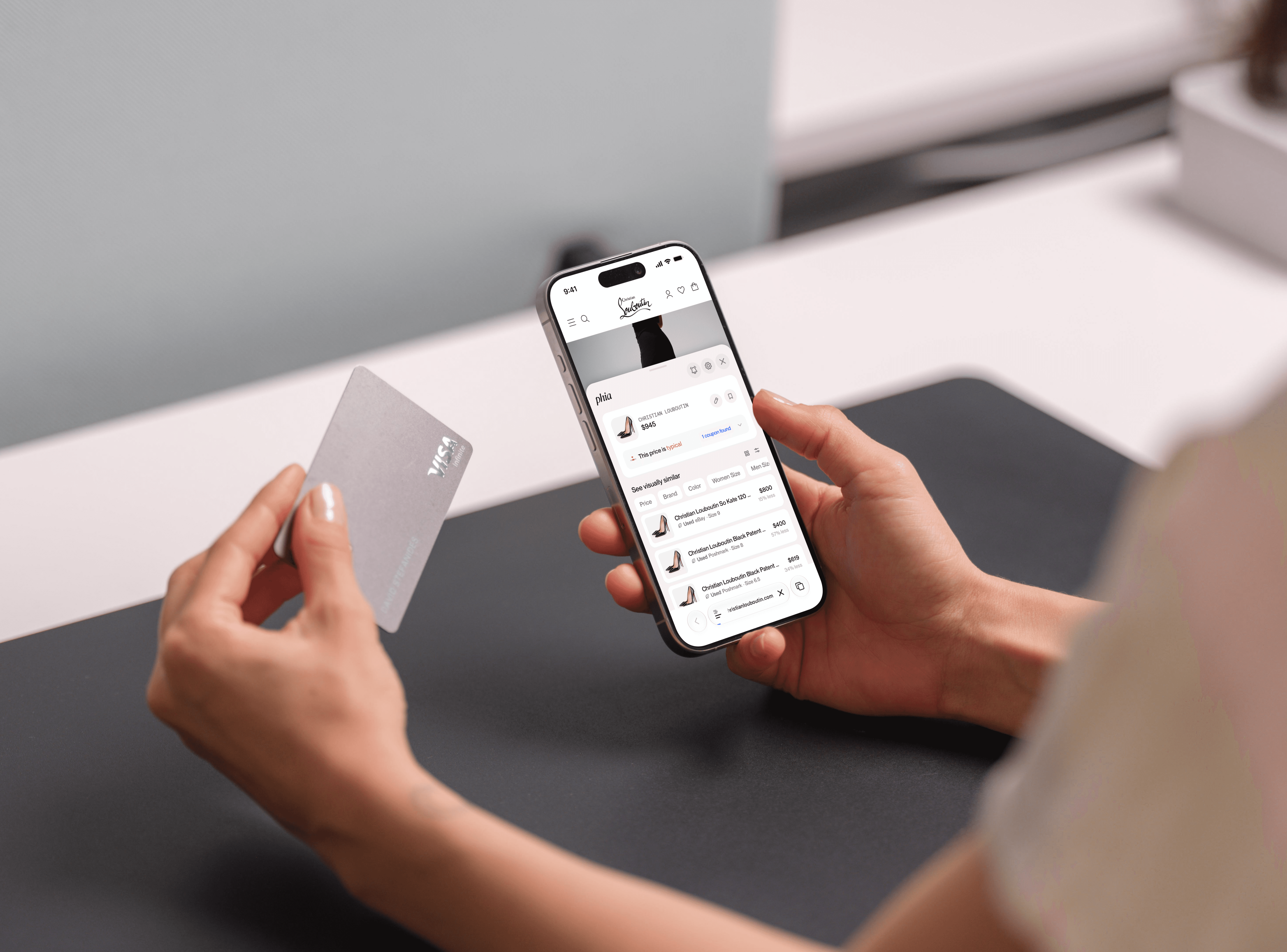
Phia helps users save money while shopping by suggesting cheaper options, with roughly 90% of revenue coming from affiliate commissions at checkout.
The Goal
Move Phia upstream into discovery to increase purchases
Phia was great at checkout, but users weren’t primarily coming to the app to discover products or sales.
We had an opportunity to move further upstream in the shopping journey—from helping users save money at checkout to giving them a reason to browse before they had decided what to buy.
The Brief
Sales Calendar – Designing a new reason to browse
Phia already had substantial sales data. Rather than creating a new source of information, the opportunity was to repackage that existing data into an experience that felt useful, engaging, and worth exploring.

The original ask from the PM was simple, but intentionally ambiguous: “Design a sales calendar.”
Product Thinking
I prioritized the sales information users needed to evaluate an offer quickly
Phia's database contained far more information than could fit into a useful browsing experience.

I prioritized attributes such as brand, timeline, sale description, discount, exclusivity, and coupon codes based on their importance when evaluating a sale.
Exploration
I explored multiple entry points and feed structures to make sales easy to discover
In exploring different approaches, I wanted to make the experience feel both useful enough to shop from and compelling enough to explore, balancing visibility, information density, and the number of sales users could browse.


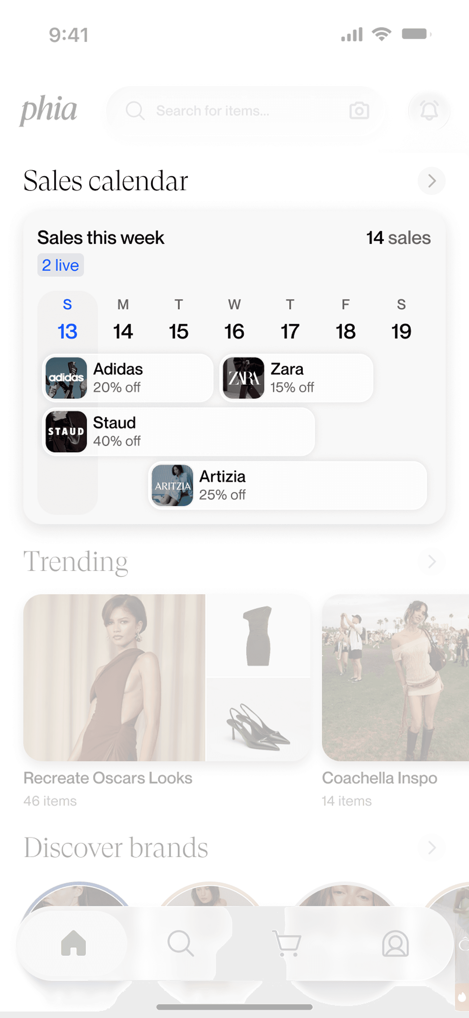
Entry point explorations
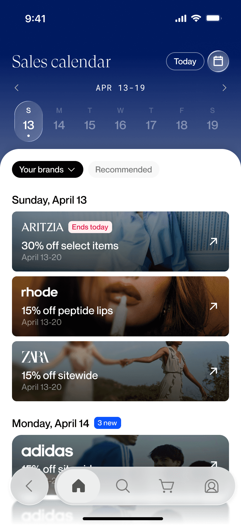


Sales feed explorations
Constraints
V1 had to balance one-tap shopping, relevance, and a fast path to launch
The experience needed to support clear interaction affordances while minimizing engineering lift.

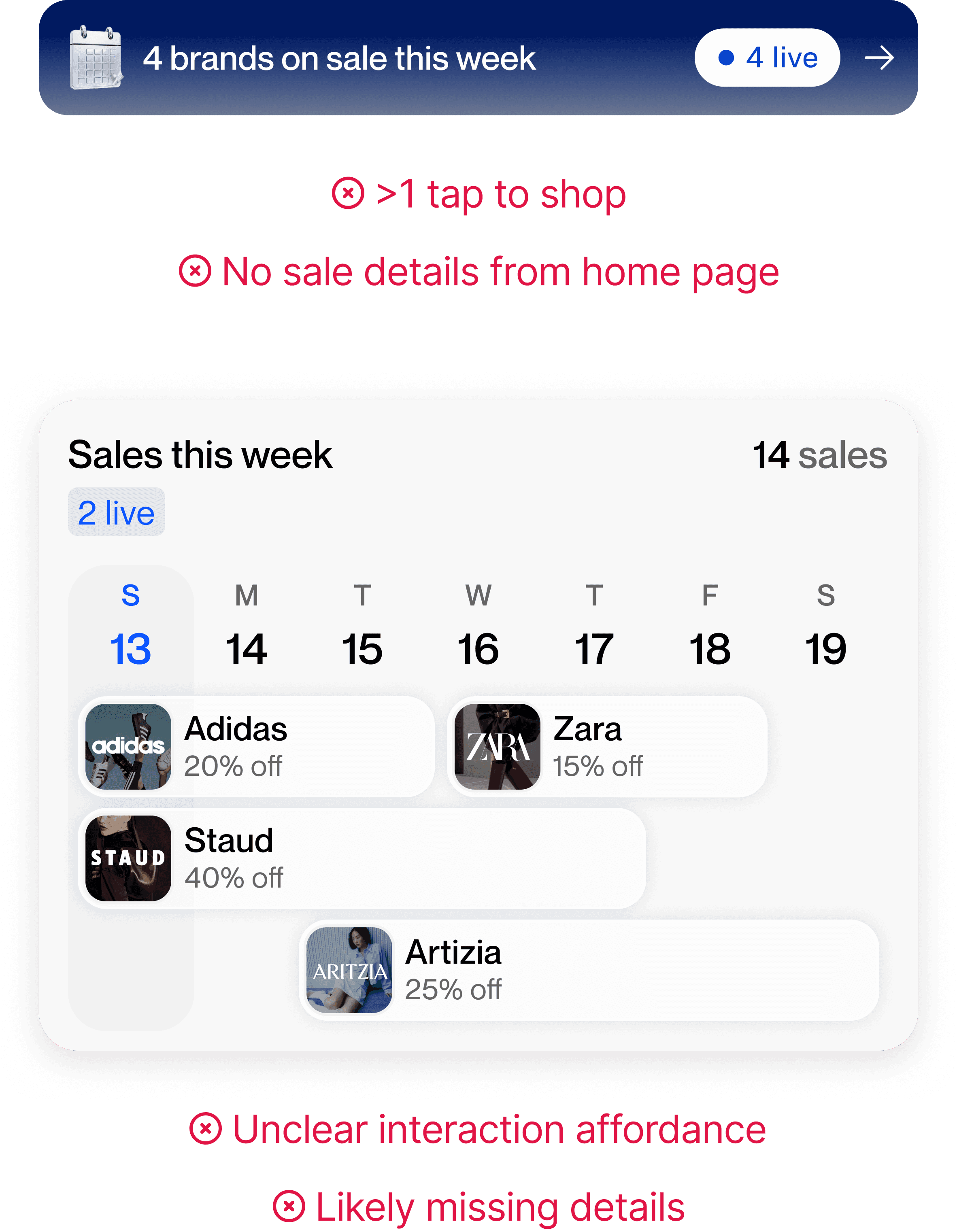

At the time, brand imagery wasn't feasible, discount information wasn't always reliably extractable, and the homepage needed to surface multiple sales without overwhelming the user.
Key Decisions
I simplified the experience to create a scannable, yet dense MVP within constraints


Through iteration, I refined the sale module and entry points by strengthening hierarchy, condensing content, and improving interaction affordances to provide the best user experience while meeting product requirements.
V1 Impact
V1 of the Sales Calendar increased app-driven purchases by 9%
This validated the broader hypothesis that creating a dedicated discovery surface around sales could influence purchasing behavior.
Insight
Users who engaged with the calendar converted well, but few users were engaging
I dug into post-launch performance, and found that while users were converting well once they engaged with the Sales Calendar, overall interactions with the entry point were low.
Hypothesis
Was the calendar's lack of visual salience limiting discovery?
The entry point of the calendar was relatively text-heavy compared with the more visual, editorial experience surrounding it, causing the eye to be naturally drawn away form the Sales Calendar.
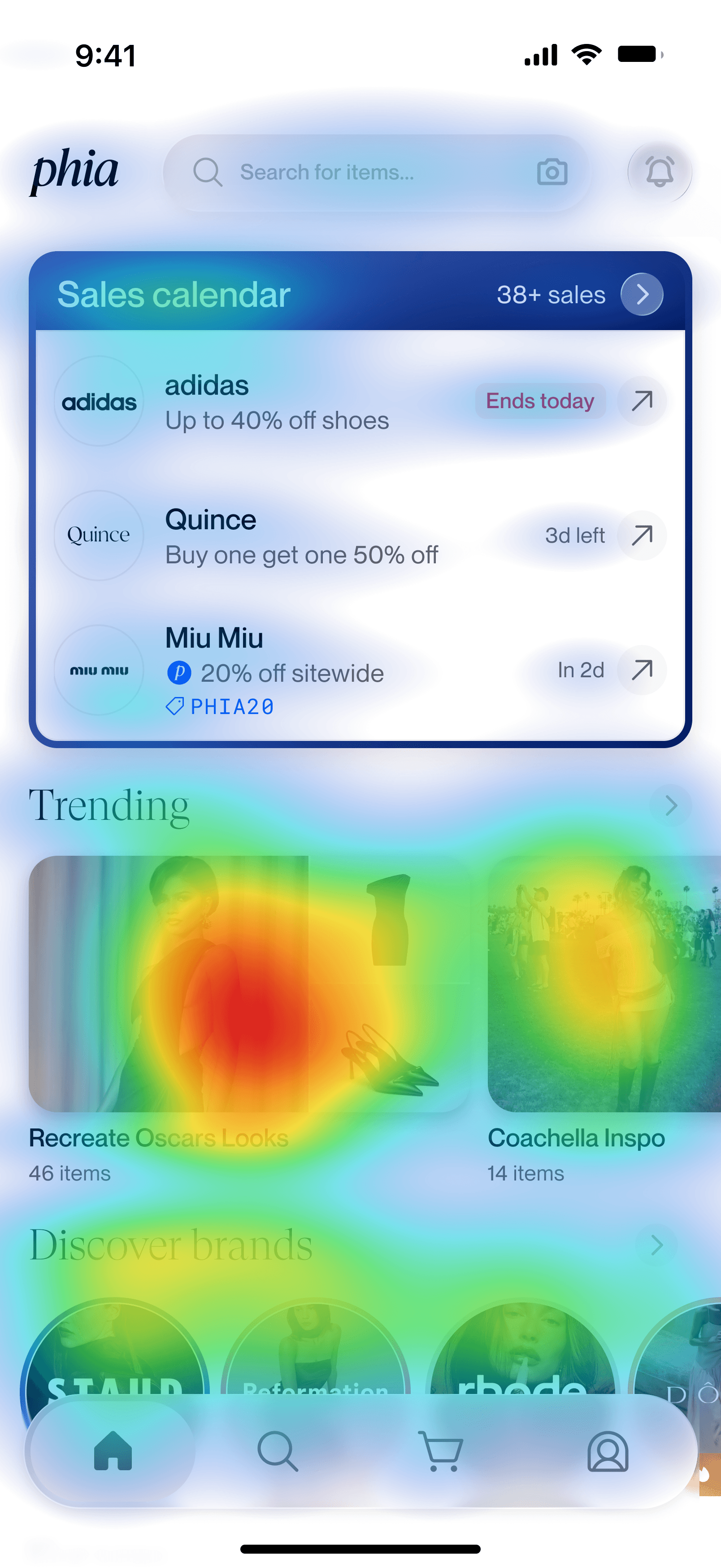
I hypothesized that stronger visual cues could make the experience easier to notice and more compelling to explore.
Revisiting Constraints
Given this, I advocated for brand imagery and worked with Engineering to make it feasible
With the opportunity to work on a V2 of the sales calendar, I brought the opportunity to Product and Engineering and explored what would be technically possible.

The engineer was able to incorporate dynamic brand imagery into the sales experience, removing the initial constraint from V1.
Tradeoffs
V2 traded information density for a more visual and engaging shopping experience
Adding brand imagery made sales more recognizable and engaging, but larger modules meant fewer sales could fit within a single viewport.


To make the streamlined modules more actionable, I redesigned the redirect experience as a bottom sheet—adding context and user control before sending shoppers to the retailer.

Validation
The visual direction increased click confidence by 71% and was preferred by 82% of users
While V2 has yet to be shipped, I ran preliminary testing where click confidence increased from 2.3/5 to 4.1/5, while 14 of 16 users preferred V2.
These results supported the hypothesis that a more visually compelling experience could strengthen users' intent to engage.
Reflection
Balancing utility, discovery, and constraints shaped a stronger product
Visual harmony drives discovery
I learned that making information useful isn't enough for a discovery experience—visual hierarchy and consistency can be what draws users in.
Designing within constraints can establish a strong foundation
Working within V1's limitations helped create a focused foundation to ship, learn, and advocate for what came next.